


In the high-end real estate sector, presentation is paramount. From the architecture of the property to the photographs in brochures, every detail must reflect sophistication. Among these elements, one often underappreciated yet highly visible tool is the estate agent board. While it may appear to be a simple marker, for luxury properties, it becomes a vital element of brand positioning and client perception.
The Role of Signage in High-End Property Marketing
Luxury buyers expect excellence in every aspect of their property experience—even the outdoor signage. An estate agent board acts as the first physical introduction to a property. It sets the tone long before the client steps through the door.
In such a competitive sector, the board must do more than simply inform; it must evoke the character and value of the property. When done well, signage conveys exclusivity, taste, and professionalism. It serves not just as a locator, but as a carefully crafted visual message.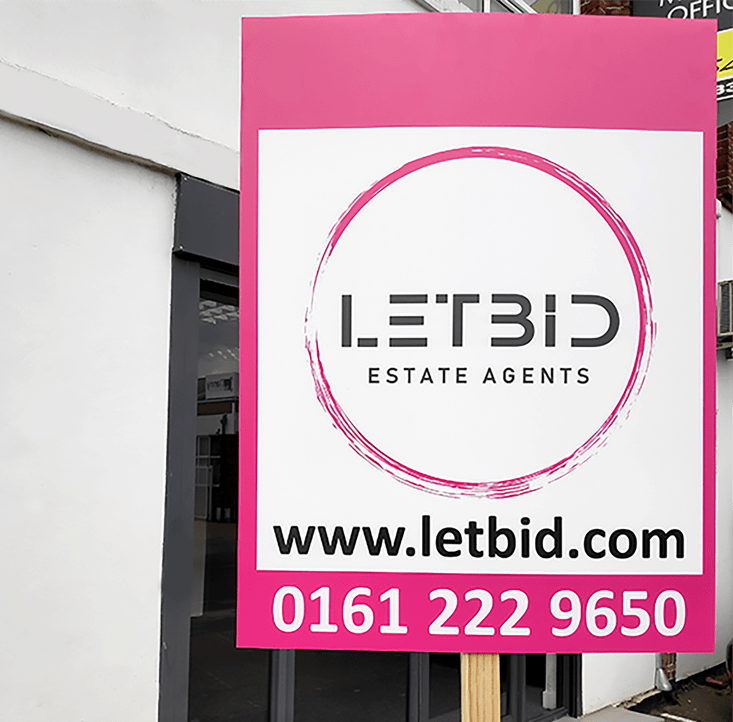
What Sets Luxury Property Boards Apart?
Estate agent boards for luxury homes differ significantly from standard signs. The most immediate distinction lies in the design quality. These boards are not mass-produced, off-the-shelf templates. Instead, they are bespoke visual tools crafted to reflect a particular lifestyle.
Key features of high-end estate boards include:
- Minimalist design with clean lines
- Subtle, premium colour schemes
- Professional, serif or designer fonts
- Textured or laminated finishes
- Logo prominence without overpowering the board
Luxury boards also steer clear of garish colours or excessive text. The aesthetic is polished and understated, relying on balance and spacing to draw attention rather than overly bright visuals.
Choosing the Right Size and Shape for Premium Appeal
Not every board suits every property. While standard sizes—like the popular 610mm x 813mm—are common in mainstream property listings, luxury estate boards often call for custom dimensions to maintain proportion with the property's scale.
Tall vertical boards may complement modern architectural lines, while wider boards can suit classic period properties. Bespoke shapes—such as arched tops or rounded edges—can also elevate visual uniqueness without being intrusive.
The key is to balance visibility with refinement. Overly large boards may come across as aggressive in residential streets, whereas overly small ones might get overlooked. Custom-shaped correx boards are often used for this purpose due to their flexibility and finish quality.
Typography, Colour, and Branding in Luxury Board Design
Typography is an underrated component in luxury board design. Serif fonts are typically associated with heritage and prestige, while sans-serif fonts can convey contemporary exclusivity when applied with ample spacing and elegant kerning.
Colour schemes should be aligned with brand guidelines and convey trust, discretion, and refinement. Think navy, charcoal, taupe, or forest green—not bright reds or fluorescent yellows. The logo should be integrated seamlessly rather than dominating the layout.
Design tips for elegance:
- Keep colour contrast high but tonal (e.g., black on champagne gold)
- Use negative space to enhance legibility
- Position logos either top-centre or bottom-corner for balance
- Limit text to essentials: agent name, phone number, and web URL
Why Material Matters: Durability Meets Aesthetic
A luxurious visual impact must be matched by material quality. This is where correx printing proves especially useful. Correx boards, made from fluted polypropylene, offer a weather-resistant and rigid surface ideal for outdoor display.
For premium boards, correx printing allows detailed image reproduction while maintaining structural integrity. These boards can be enhanced with:
- Gloss or matt lamination for refined finishes
- UV protection to prevent fading
- Fade-resistant inks to maintain branding integrity over time
Correx is also lightweight, making installation easier while reducing the risk of sagging or tilting, which can spoil the professional look of a display.
Compliance and Discretion: Navigating Luxury Neighbourhoods
Many luxury homes are located in conservation areas, gated communities, or neighbourhoods with tight restrictions on advertising and signage. In these areas, discretion is key.
Boards should be designed not only for visual appeal but also in accordance with local council regulations. For example, avoiding reflective finishes in certain locations or limiting the height and visibility from the road.
Tips for compliance with elegance:
- Choose subdued finishes that blend with surroundings
- Use muted tones that respect neighbourhood aesthetics
- Avoid placing boards near protected trees or historic façades
- Ensure temporary boards are securely fixed and removed promptly post-sale
Sustainable and Recyclable Boards for Modern Luxury Listings
Luxury no longer exists in a vacuum; it must consider environmental impact. Clients seeking high-value homes are increasingly aware of sustainable practices—not just in properties but in how they are marketed.
Fortunately, correx boards are 100% recyclable, making them a practical choice for eco-conscious listings. Many print companies now offer low-VOC inks and recycled fluted plastic options to reduce environmental impact.
As part of your pitch, using environmentally responsible signage practices may even give your brand an edge among ethically-minded clientele. Sustainability is becoming synonymous with luxury—discerning clients expect both.
Double-Sided and Directional Boards for Better Navigation
Luxury properties often include large plots, private roads, or tucked-away entrances. In such scenarios, double-sided boards or directional signs play an essential role in guiding visitors without excessive clutter.
Benefits of double-sided estate agent boards:
- Enhanced visibility from multiple angles
- Improved wayfinding in cul-de-sacs or private roads
- Reduced need for multiple signs
- A polished, cohesive visual message
Directional boards can be used at intersections or drive entries, again designed to maintain the premium look—smaller in size but consistent in branding.
Installation Tips for Maintaining a Premium Look
Even the most elegantly designed board can fail if installed poorly. An askew, damaged, or weather-worn board will undo all efforts made in design and material selection.
Professional installation is advised for high-value listings, with attention to:
- Plumb line alignment to avoid slanting
- Secure fixtures that avoid movement in wind
- Elevation that keeps the board visible but not obstructive
- Frame options that match the board’s aesthetic (e.g., black powder-coated steel or wooden stakes for rustic properties)
Maintenance also matters. Boards should be cleaned regularly to remove dust, pollen, or bird droppings—especially when on display for extended listing periods.
Conclusion – Crafting a Luxurious Impression That Lasts
In the world of luxury property, every detail tells a story. Estate agent boards, far from being an afterthought, act as the introduction to that narrative. From material selection and typography to size, sustainability, and installation, each decision contributes to the overall impression a potential buyer receives.
With the durability and versatility of correx printing, paired with sophisticated design and branding, estate agents can create signage that speaks to exclusivity and taste. As marketing tools, estate agent boards offer a unique opportunity to blend form with function—elevating listings while reinforcing brand image.
Board Printing Company offers premium-quality board solutions tailored to the distinct needs of luxury property professionals, ensuring your first impression is always a lasting one.